Multi-Color Pen Plotting: Split a Photo into Pen Layers
Separate a photo into CMYK, RGB or custom pen colors for multi-color pen plotting, using a downloadable color test chart to compare split methods first.
By DrawingBots · Published
How colour separation works
A pen plotter draws one pen at a time. To plot a photo in colour you split it into one drawing per pen, plot them in turn on the same sheet, and let the overlapping lines mix on paper. Image to SVG does the split for you: choose a mode under Colour and every algorithm produces one layer per pen instead of a single black drawing.
- Output picks the pen set. Monochrome is one pen. CMYK separates into cyan, magenta, yellow and black, the printing primaries; turn Include K (black) off for a three-pen plot. RGB puts ink where a channel is strong, which is meant for red, green and blue pens on black paper; on white paper it draws the background. Custom lets you enter the actual pens you own.
- Method decides how pixels are assigned. Classic split separates ink channels directly, so a purple pixel contributes to both the cyan and the magenta layer. Colour match gives each pixel to the single nearest palette colour, which suits a custom set of pens that do not mix like inks.
- Tuning hides two sliders. Ink gamma is the response curve from tone to line density; a higher value keeps light areas cleaner. Distance power (custom mode with colour match) controls how strongly a pixel prefers its nearest colour over the runner-up.
The downloaded SVG contains one <g> per pen, with ids such as cyan, magenta, yellow, black or custom-1, and every path in it carries the pen’s stroke colour. Plotting software that reads layers or groups colours, such as Inkscape with a plotter extension, vpype or the AxiDraw and NextDraw tools, can plot them one at a time with a pen change in between.
A colour test chart to plot first
Before spending an evening on a portrait, plot a chart that shows how your pens and settings behave. The one below is generated rather than photographed, so each region tests one thing.
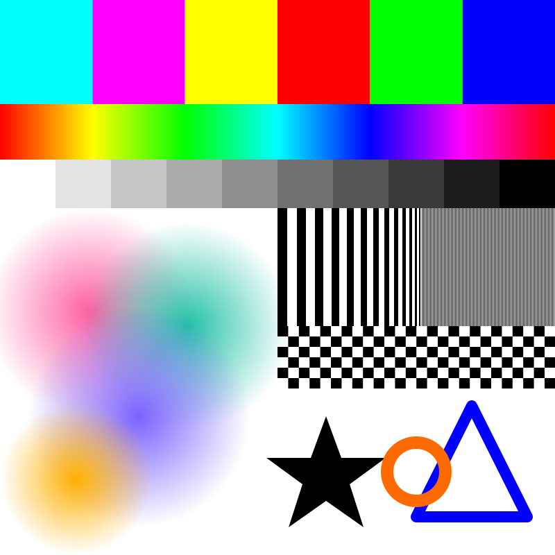
- Six solid blocks (cyan, magenta, yellow, red, green, blue): does each land on one pen, or on two?
- Hue sweep: where do the transitions between pens fall?
- Grey ramp: how does line density track tone, and where does the black pen take over from mixed colours?
- Soft pastel discs: how gradual mixes are handled; this is what skin and sky look like.
- Stripes and checkerboard: the finest detail a given line count can resolve.
- Star, ring and triangle: clean edges and a thick coloured outline.
Plot it once with your real pens and keep it: it tells you which colours your set can and cannot make.
CMYK versus RGB versus a custom palette
The chart was converted four times with the Squiggle algorithm at default settings, changing only the colour mode.
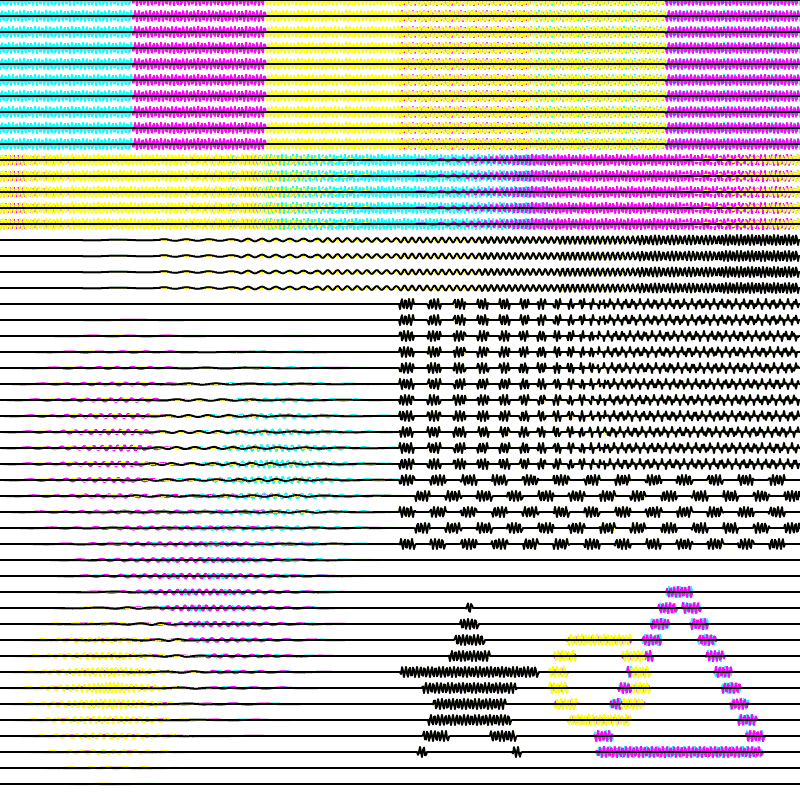
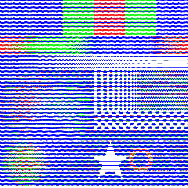
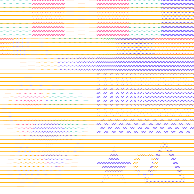
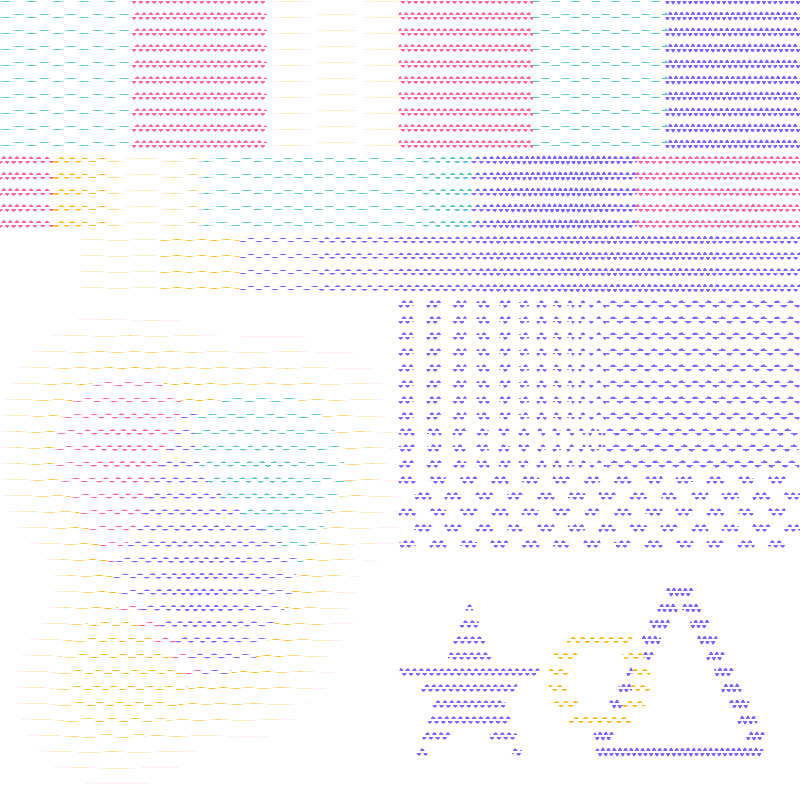
Two habits follow from this. Use CMYK when your pens are close to printing primaries (many fineliner and gel sets are). Use Custom with Colour match for any other set, and add your paper colour to the palette so that the background is captured by a layer you can delete instead of being forced onto a pen.
Open this design in Image to SVG · settings: color-test-chart.png · Squiggle · Output Custom · Method Colour match · palette #ff5fa2 #22c1a6 #7b61ff #ffb000 #ffffff
A real photo in colour
Photos are more forgiving than the chart because their colours are mixed, but a light, pastel image like the corgi shows the same trade-offs.
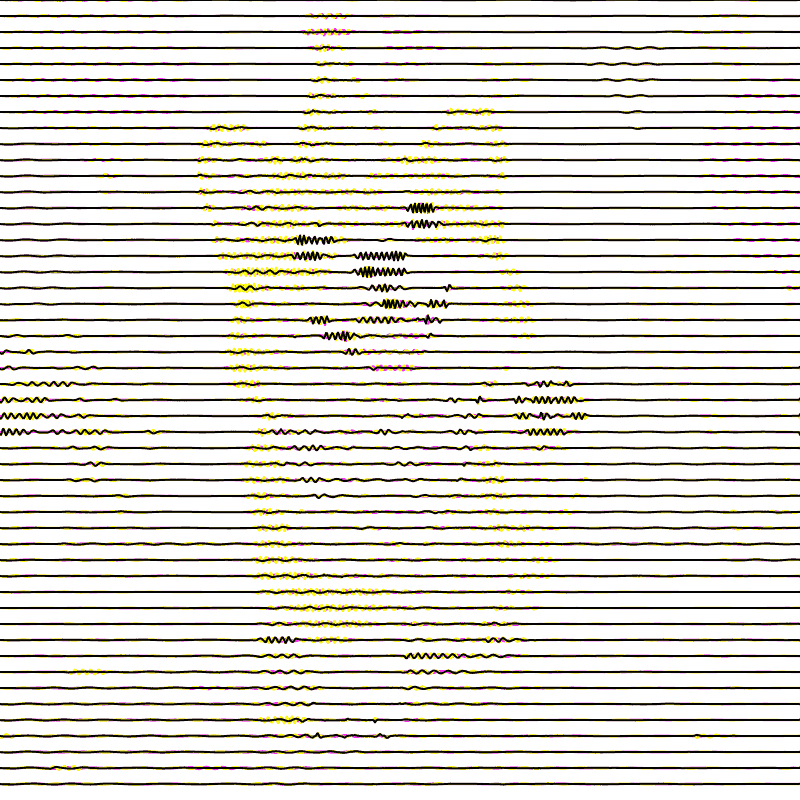
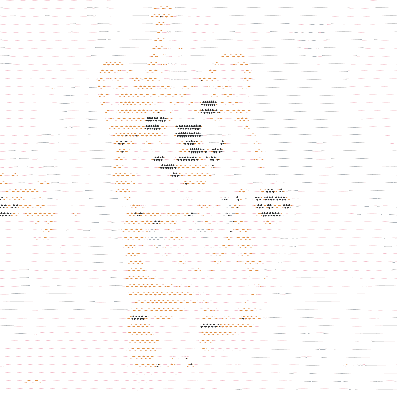
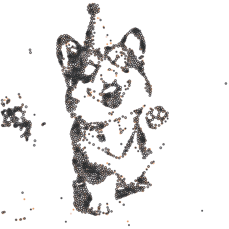
For a custom palette, sample the photo: pick the two or three colours that cover most of it, add a dark pen for eyes and shadows, and finish with the paper colour. Keep the pen count small. Each extra pen is a pen change and a chance for registration error, and colour match spreads the available ink thinner across layers.
Dot-based algorithms share their Max Stipples budget across layers evenly, so a colour that appears in only a small area still receives a full set of dots and looks heavy. Line-based algorithms such as Squiggle scale naturally with the area each colour covers, which makes them the easier starting point for colour work.
Pens, plotting order and registration
- Plot light to dark. For CMYK that usually means yellow, then cyan, then magenta, then black. A dark pen drawn first will smear into the lighter ones and bleed through thin lines.
- Do not move the paper. Tape it down or use a registration frame, and keep the machine powered between pen changes so its home position is not lost. A drawn corner mark on a scrap sheet helps you check that nothing shifted.
- Match the pen width to the line spacing. Layers add up: four overlapping squiggle layers at 50 lines each put four times the ink on the page. Raise Ink gamma or lower the line count for multi-pen plots.
- Let each layer dry before the next pen, especially with gel and paint pens.
- Check the layers before plotting. Open the SVG in Inkscape and look at the Objects or Layers panel: each pen is a group. Delete the white layer from a custom palette, and verify that the groups carry the colours you expect. Plot Preview shows how the combined drawing sits on your paper.
Troubleshooting
- A pen draws the whole background: you used RGB mode on white paper, or colour match without the paper colour in the palette. Switch to CMYK, or add white to the custom palette and skip that layer.
- Colours look muddy: too many pens or too much ink. Reduce the line count per layer, raise Ink gamma, and plot light colours first.
- A colour is missing from the plot: its layer may be very sparse. Check the group in the SVG; with colour match, lower Distance power so pixels are shared more generously.
- One layer is much denser than the others: for dot algorithms this is the shared dot budget; use a line-based algorithm or reduce Max Stipples.
- Layers do not line up: the paper or the home position moved between pens. Re-home, tape the paper, and plot a small test first.
The figures on this page are browser exports rasterised for the web; the pen advice reflects common plotting practice and no physical plot of these files is claimed. For the single-pen basics, start with the image-to-SVG guide; for an entirely different multi-pen approach, try Doodle Mosaic, which can split a mosaic into pen layers by tone or by category.